Minimalist Digital Planning
I recently was gifted a new iPad by my parents, which has allowed me to delve anew into the world of digital organization. And my, how things have changed in terms of what one can do! Now I can take handwritten notes and draw on my iPad and read and easily annotate. It makes studying so much more convenient.
For as long as I started adulting, I have always used a planner. It took awhile to find my perfect planner, one that I actually used. For a few years I was a Moleskine planner gal, heavily preferring the vertical layout. However, Moleskine changed their layout a few years back and, since then, it has been a struggle to find something I would consistently use. This past year, I did switch to the horizonal agenda by Fringe Studio.
But that was before I discovered the world of digital planning and all the cute stickers and fonts I’m currently gaga over.
As with physical planners, I did spend some time figuring out which digital planner style worked best for me. Since I have been unsatisfied with previous purchases (they either had too much or too little), I simply decided to design my own planner that suited my workflow, organizational preferences, and aesthetics. I didn’t need to plan and write down every single aspect of my life, but I did need to track the many responsibilities I had in all the roles I had to play.
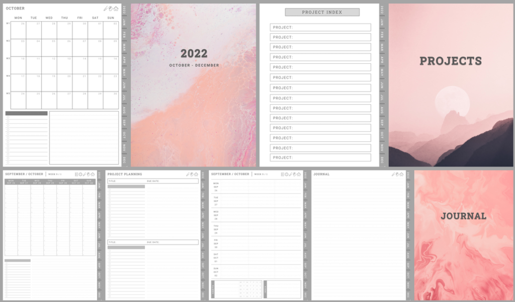
As a break from studying, I created this planner for the last quarter of the year (October-December 2022). It has monthly pages for my brainstorming and scheduling major events, horizontal pages in 3 subjects for weekly planning of just writing what to do, and a vertical layout (but in a weekly spread) for daily scheduling and time blocking. This is because sometimes, to-do lists just won’t cut it! Scheduling to do it is what works – hence the two styles for weekly layouts.

I then customize each week with stickers obtained from other creators. My favorite sets are from DPC Digitals. I do my best not to spend a lot of time on creating cute layouts because then I waste precious time. But it does make looking at my busy week easy on the eyes (and heart).
The layout is minimalist enough to customize for anyone’s needs. It also has a simple projects section and a notes section. Monthly and weekly pages are hyperlinked, as well as projects and notes to the index. It’s only on portrait mode because I have grown tired of rotating my iPad when reading and writing on my planner. Also, I just plan on my GoodNotes app, so I’ve only tried this planner on this app. I don’t see why it won’t work on ther planners though!
I have put this planner for sale on Etsy for CA$3.00. This is an inexpensive option for people who want to try digital planning (or has a similar workflow to mine).
For next year, I am thinking of keeping the same layout with minor tweaks and possibly add linked daily pages.
What is your ideal planner like?


