New Undated Daily Planner with Weekly Overview – FREE
For the last six months, I have been using the digital planner that I have designed to plan out my weeks. On days that I am extremely busy, I use a daily page as well (whether on paper or digitally).
However, I have found that when I simply have too many things to do and am overwhelmed, I tend to shut down and simply try to wing it from day to day. I barely check the monthly page of my planner for things I had scheduled and mapped out for that month. I don’t even look at my weekly vertical layout, list of things to do, freezer inventory, or meal plan. I just let it be.
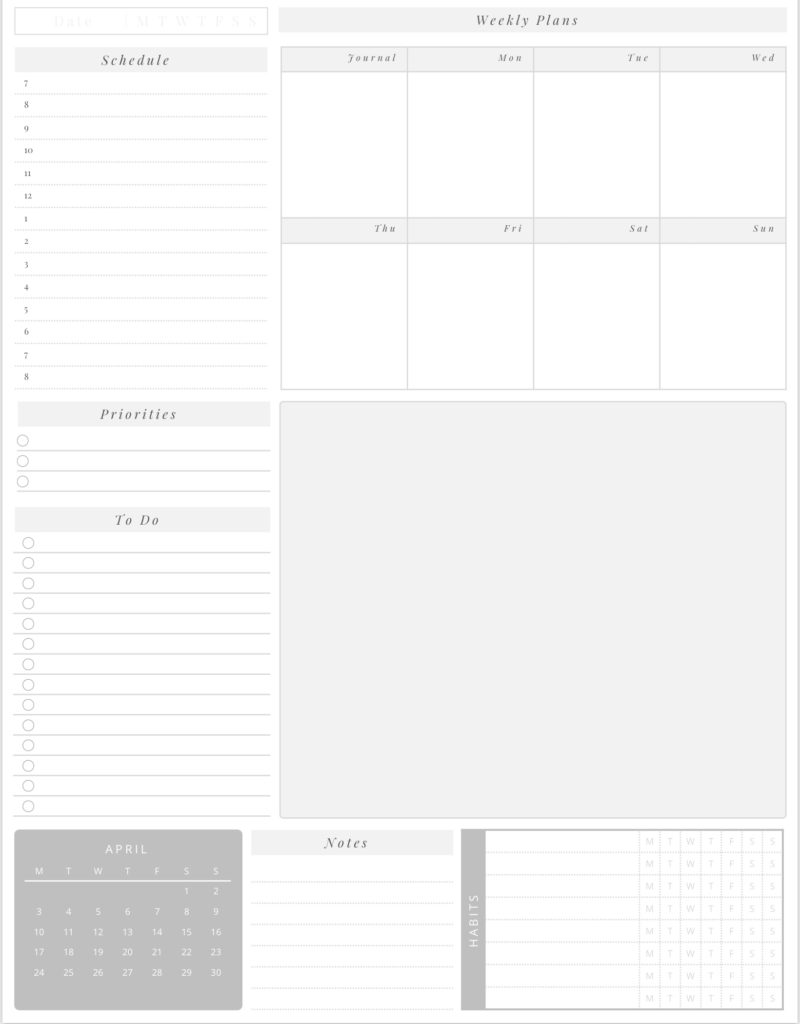
This, however, resulted in me being less productive and letting areas of my life slide a bit too much. (Yes, I like to have control and make sure things are in place as much as I can.) Because of this experience, I ended up designing a template that has the following:
- Daily schedule
- Daily priorities
- List of things to do (could be weekly, monthly)
- Space for the week’s overview
- A large blank space
- Area for notes
- The month’s mini calendar
- Habit tracker

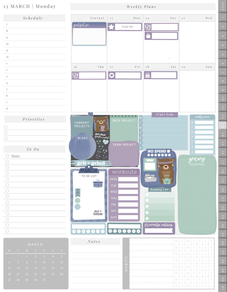
I used this template to make myself a monthly planner with daily links. I also use the big blank space for other trackers and my monthly layout, so I don’t forget what I have pending. With this, I simply carry over the weekly and monthly trackers to the next page, even when I jot my daily plan down on the left side of the page. (If you find the stickers cute, simply head over to DPC Digitals. I get my stickers from there; they’re amazing. And they also have a great selection of planners to check out.)

I am making this page free to download on Ko-fi every month (as it comes with a mini-calendar on the lower right side). I can use this for very busy days (or weeks or months), as there is a psychological impact (such joy and new hope!) to turning over a new page for the next day. But with this layout, I also have enough space to copy my weekly and monthly plans and so relieve myself of the unease of forgetting something.
For now, I have switched back to my regular weekly layouts, and I customized the layout to make it work better for me. I also made some changes – most importantly, I time-blocked especially the tasks I was tracking. For example, I removed my NO SPEND tracker and the sticker for tracking gas prices. Instead, I added the following:
- Specific study plan trackers (like what exactly am I reading)
- Grocery list (sorted according to shop)
- Aa space for a short weekly gratitude journal note (which is all I have time for),
- A to-cook menu (because I usually have on my meal plan previously cooked food that I have frozen)
- Self-care to do-list
- Separate to-do lists for specific aspects of my life (like homeschooling my toddler)
- Separate lists for projects that require frequent check-ins but are not too urgent (e.g. arranging electives, reading list, study plan for upcoming exams)
- Small spaces for things that come up on a daily basis (e.g. paperwork, phone calls to make)
As for the monthly/weekly/daily page that is all in one, I am debating whether or not to release a monthly dated planner with pages like, with links to daily pages on the right, possibly on a subscription model. Or I may toy as well with other layouts. What do you think?


